Composition is Key
Part 2 on Tips for Zooming
- Apr 8, 2020
- networking, looking good, zoom, photography
- Marketing
- Paul Richardson
“A camera is a tool for learning to see without a camera.”
– Dorothea Lange
If you got through my lengthy post on how to improve your Zooming with better illumination, it’s time to get into composition, or how things (mainly you) are organized within the frame.
We are not aiming for “art” or “drama” here, but trying to work within a standard, expected convention. Mostly we are just trying to get a nice shot of your head somewhere near the center of the video frame. So I am mainly going to deal with two things: your position in the frame and your background.
You
The technology of web and phone cams is such that they generally all use wide-angle lenses, in order to encompass as much real estate as possible. That’s good for some things, but not good for others.
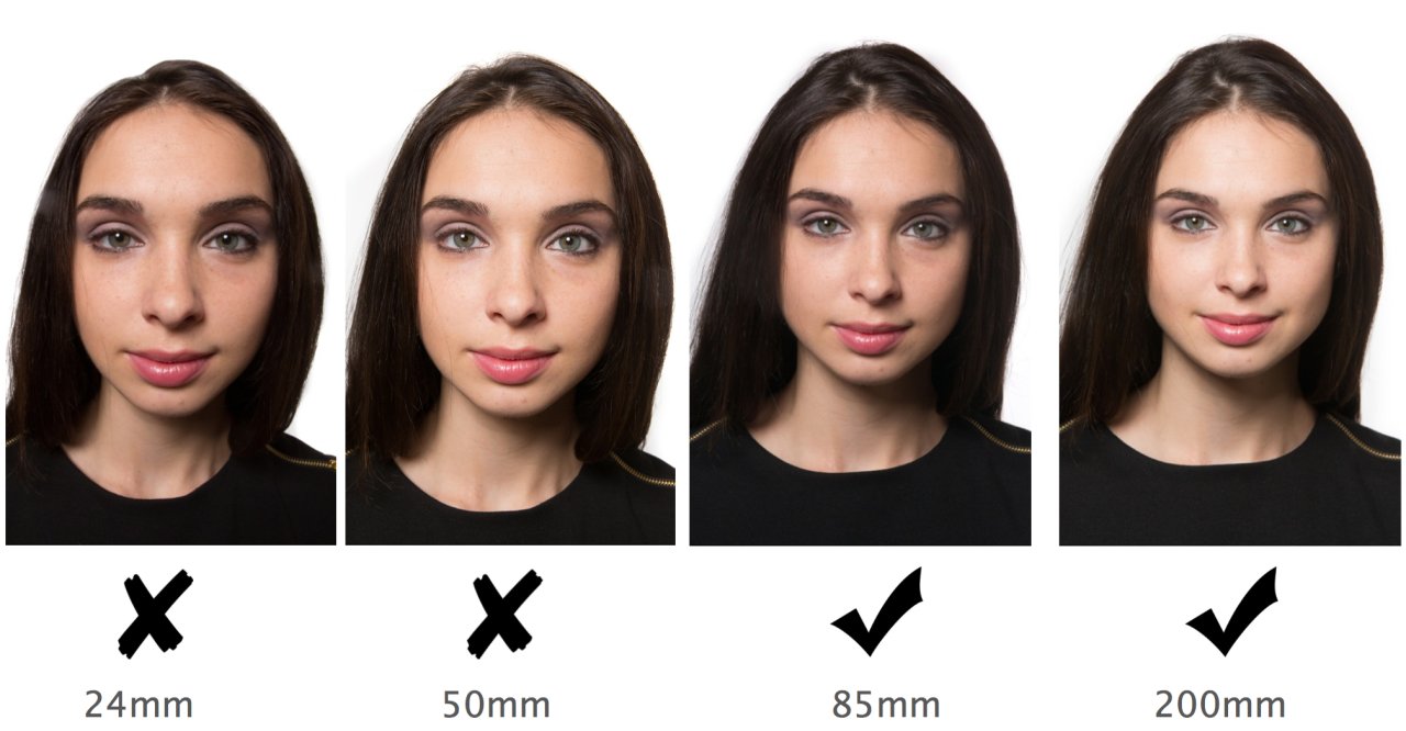
For the human face, you generally do NOT want to get your face close to any lens because it tends to distort facial features. Take it from someone of strong German lineage with a healthy nasal protuberance: the closer something is to a lens, the larger it looks. And wide-angle lenses are serious offenders on this score.
So, when you are in the preview mode before your conference starts. Sit back a bit farther from the camera than you might normally, then move your head closer and farther from the camera and find a happy spot where the camera does not enlarge your features and yet where you are not a distant peanut in the screen.

24mm? That's the sort of focal length you will find on webcams.
Back up to mitigate its effects.
Photo credit: Creative Live
And don’t try to fill up the screen. Sit back far enough so that your facial features seem normally proportioned within the frame.
Second, camera angle is really important. You generally want the camera aimed straight at you, from an angle about equal to or slightly below your line of sight. You want to have to tip your head just slightly down toward the camera. This gives you a flattering, heroic look.
So place your laptop or monitor on top of a stack of books if that is what it takes to elevate its line of sight for the duration of the meeting.
Caveat: If you are concerned about your weight and want to trick the camera into making your face look smaller and possibly thinner, have your camera sit a bit higher, and angle your face up toward it. It’s simple, really: just remember that whatever is closest to a lens will look larger, so, if you want the lower half of your face to look smaller, it needs to be farther away. Likewise, if the camera is angling up toward your face or positioned too low, it will tend to make the features on the lower half of your face (cheeks, chin, lips, nose) look larger.
Also, try to have the screen of your computer perpendicular to your desk surface. Tilting the screen back, like you may do for normal working and viewing, is going to have the camera shooting up at you, and that is rarely good. We have all seen the conferee who has their screen tipped way back and then we spend the whole time staring up their nostrils.
Not a good look.
Similarly, you want to avoid sitting with the computer in your lap and angled up to your face. That will distort your proportions (making your chin look large), bring things (gut, chest) into the frame in a way you don’t want, and it will also make good lighting very difficult.
So, let’s summarize.
For the best look, sit at a desk. Put your laptop on some books, or stand if you need to, or raise your monitor and webcam so that the center of the camera is just below eye level, and have the camera pointing straight at you, not upward. And don’t get too close.
Every camera is going to be different, so test what you have and how it makes you look, take note of that, and then stick to those settings.
The Background
Zoom and others offer software tricks that can blur out your background, which might be a good idea if it is a bit cluttered.
And then there are the "virtual backgrounds," where you can insert a photo behind you. Resist this fad. It is visually distracting and not super professional, plus the technology cannot perfectly cut out hair, so there’s a good chance you are going to look like you have helmet head.

It is best to just spend a few minutes cleaning up clutter from your background and considering how it looks inside the frame (preview mode before a call is a good time to check). Clutter here does not so much mean a bunch of “junk,” as that there is a lot going on that may be distracting, making it hard for viewers to distinguish the subject (you) from the background.
In portrait photography, we will sometimes shine a faint light on the subject from the direction of the background, to cast a rim of light around their outline, which helps them “pop” out of the background. Obviously, that is not something you need to try to do, but you can achieve the same thing by being in front of a background that does not have a lot of distractions, or that has nice muted tones, so that the main thing someone’s eye is drawn to is your face, not some bright green knick-knack on the shelf.
Look for clutter and large objects that, when compressed into two dimensions, will appear as if they are coming out of your head. And arrange any large, visible items in the background so that they are not all on one side of the frame, or all on the same level as where your head will be. Strive for some Zen-like balance in your frame if you can.
You should also think about leading lines. This is when lines in the frame direct the eye to look somewhere, usually from one end of the frame to another. In the case of video conferencing, one of the best looks is to have the lines of the background behind you converge toward a natural diminishing point in the center of the frame, where we find you. You can achieve that if you have a long room behind you and the realities of photography will make the distant wall seem smaller, and so it looks like you are in a telescoping room. It can be a bit transfixing.

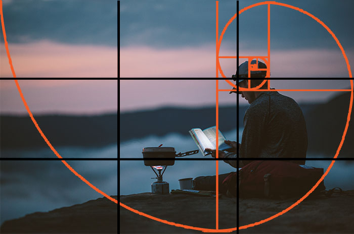
to help guide composition in photography,
but the main compositional rule for video conferencing
is the Rule of Clutter: get rid of it.
Pay attention to how television reporters or anchors arrange their backgrounds on TV interviews. They are all being done from people’s homes now, so they are starting to get a bit of attention. Notice how they create some balance, or select backgrounds with muted, earthy, natural colors.
Three Final Notes
So obviously it matters how you put these two things together, you and your background. As noted, you want you to be the most prominent thing, but you should be in pleasing balance with the background: not so close to the screen as to make your nose protrude, and not so distant that you get lost in the wall hanging.
But let’s talk about hands.
Body language expert Vanessa Van Edwards, in her book and talks, points out how, as social creatures, we humans get important cues and hormonal feedback from both direct contact (handshakes, hand on shoulder, etc.) and from body language. And hand activity is particularly important. She notes how people actually can get a bit unsettled if someone is talking with their hands behind their back, or if one’s hand gestures do not match their speech. And studies have shown that good use of hand gestures during TED talks are directly correlated with talks' virality (or lack thereof).
The point here is to remember that video conferencing can hide our hands, which are important and influential tools of communication. So be sure to set up your camera and framing so that your hands can show up in the screen (and not too close to the camera, unless you want to emphasize your finger girth), and don’t just leave them lying on or under the desk. Use them in the video conference as you would in a conversation. It will help you jump out of the Brady Bunch box you have been consigned to.
How about sound?
That's a whole other can of worms. There are limits to what you should expect if you are relying on a computer's built-in microphone. You will get the best sound if you put yourself in a small, carpeted room that is not empty, so that there are things like couches, chairs, bookshelves, and what not to absorb sound waves and lessen reverb (when it sounds like you are in a large metal box).
For the best sound results, invest in a decent pair of noise-reducing headphones with a built-in mic that is close to your face.
Don’t forget to look at the camera.
Watch TV interviews (or pay attention during video conferences) and recognize how unsettling it is when someone does not keep almost constant contact with the camera when being interviewed or speaking. If someone continually casts their eyes away, even if it is because they are searching for a thought, it tends to make the person look shifty and less reliable. Not making eye contact is a generally recognized “tell” that someone is being deceitful.
And we can all agree that’s not a good look.