Tips for Better Zooming
Why video conferencing is like a photo session
- Apr 1, 2020
- looking good, networking, zoom
- Paul Richardson
2000
“On the internet, no one knows you are a dog.”
2020
“During the Plague, everyone sees your cluttered home office.”
Let me tell you a secret.
As a headshot and portrait photographer, I have found that roughly 98.65% of my clients will at some point before we begin shooting say something to the effect of: “I hate having my picture taken.” Or: “I look awful in photographs.”
Even the people who don’t say this whisper it with their eyes, or shout it with body language. So a big part of my job is assuring people that the most likely reason for their discomfort is that they have been doing it (i.e. getting their photo taken) wrong. And then I show them how to do it right and they are amazed at the results.
Anyway, since we are all now spending so much time in front of video cameras – in effect unwittingly subjecting ourselves to hour-long headshot sessions – I felt it would be useful to offer tips from a photographer on how to do Zoom (or Teams or Hangouts or Whereby) better.
There’s a lot to cover. So I will break it into a couple of posts. Let’s begin with…
LIGHTING
Great photography requires attention to lighting. Because if you get that really wrong, there's little hope.
The other day I literally had to turn away from a TV news broadcast because they were interviewing someone over Skype and the woman had up-lighting. She surely had no idea that she looked like someone who put a flashlight under their chin on Halloween.
Don’t be her.
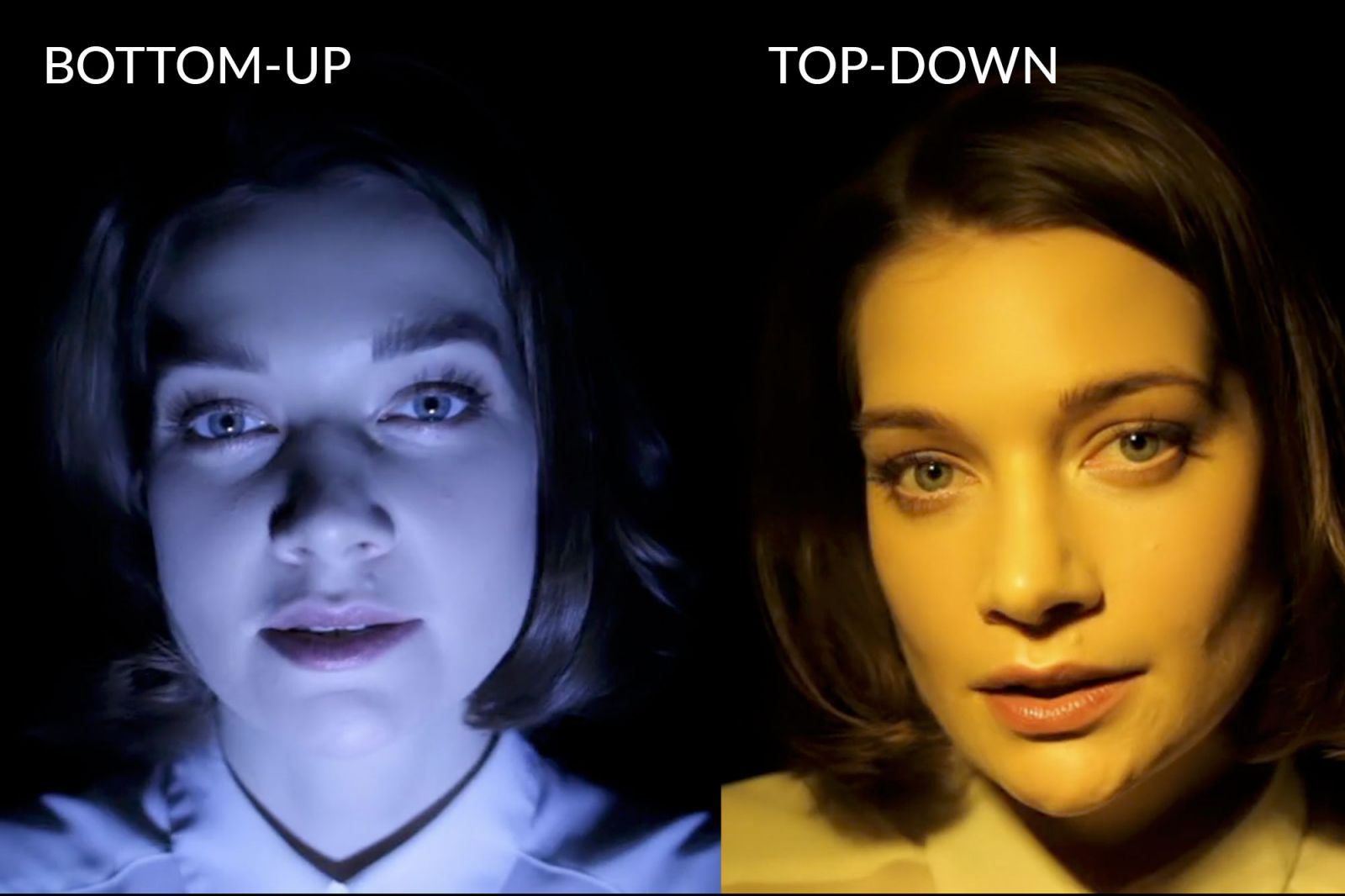
Examples of lighting from below and from above. (slrlounge.com)
But this example highlights the important fact that light is directional. And we have hundreds of years of experience from portrait painters and photographers to show us which lighting directions and intensities work and which do not. The upshot: you want the lighting on you to be soft, close, and in front of you. Window lighting is the best and easiest solution in the daytime; well-controlled bounced light is best in the evening.
 Portrait with Rembrandt lighting.
Classic Rembrandt lighting (yeah, that guy) is when the light source originates from 45 degrees off-center from the subject and is also elevated about 45 degrees. It produces a nice, dramatic triangle of light on the subject’s off-side check (see above). It’s a good look for portraits, but that drama can be lost on tiny webcams. But you can start with Rembrandt and improve on it: try a set up where you have two soft lighting sources, both hitting you from 45 degrees on opposite sides and a bit above your eye level. This fills in the shadows and offers a soft, even look.
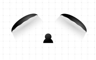
One good lighting setup.
Another good option? Sitting with a single large light source (e.g. a window) directly in front of you and having that light be even, diffused, and largely downward-facing.
A downward tilt is important, because our minds are used to the sun and how it casts its light down on us, which is likely one reason why up-lighting is so strange-looking. It is just unnatural.
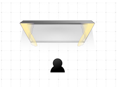
Hard to beat a good, large window.
So those are two good setups. Here are four things (other than up-lighting) that you want to avoid with your lighting.
Heavy Backlighting. Don’t sit with a large window or bright light source behind you. While professional photographers can get some amazing images using this sort of lighting, it requires good compensatory front-lighting and can be tricky. Don’t try this at home. Your webcam will either turn you into a silhouette or blow out your background.
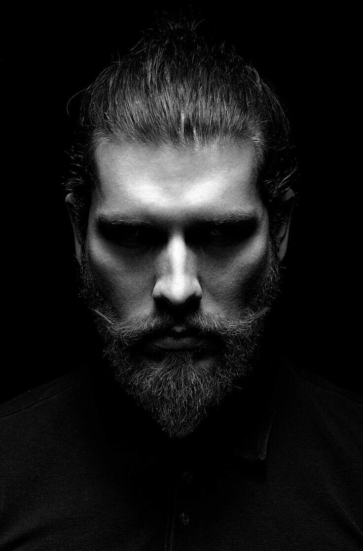
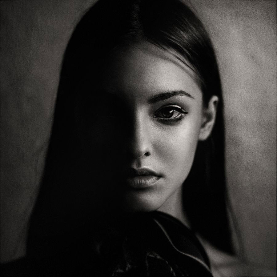 Split Lighting. Strong light coming at you directly from one side, perpendicular to your face, with no light coming from the other direction, can lead to one half of your face in light and the other in dark. Again, a dramatic look that works for portraiture, but don’t trust it to work for a business meeting. That said, you can get good results if you have strong, soft light coming at you perpendicularly from both sides, yet ideally the lights should not be aimed directly at you, but just in front of you. This offers a very pleasing light that wraps around the subject (you) and is similar to one of my go-to lighting setups for headshots. It can be very flattering. Split lighting photo: Anna Shakina
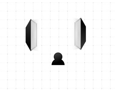
This sort of parallel lighting is also flattering.
 Top Lighting. I see this all the time too. Someone sits in a room on video conference with just a bare bulb or one overhead light hanging directly above their head. Not a good look, especially for those who are follicle-ly challenged. If this is all you have, then slide back about two feet so that the light is out in front of you. That gives it a chance to travel down and wrap around you. It's likely not good, but it's also less bad. (Read on for how to fix it better.)
Hard Lighting. The farther light is from a subject, the harder and more contrasty it is. The bigger and closer a light is to a subject, the softer it is. Hard and soft here actually refers to the shadows the light creates. Think about the sharp, contrasty shadows thrown at midday by the sun (very far away), versus the soft shadows when someone sits close to a window, out of direct sunlight. You get the idea.
There’s even a science-y bit to this: it’s called The Inverse Square Law. This law states that the intensity of a light is inversely proportional to the square of it’s distance from the subject. Now if you, like me, were forgetting the first part of that sentence before you even got to the end of the second part, let me explain it in terms for us non-science-y folks.
TISL means that the farther you position a light from something, the more of it you will need to maintain the same exposure or intensity. And that “more” is a geometric progression (sort of like one of those infection curves we’ve all been obsessing over), not an arithmetic one. Other things like ambient light and fall-off get talked about with TISL, but the main implication for our purposes here is that a light’s intensity diminishes faster than you might think: when you double the distance between a light from a subject, the amount of light reaching the subject is not one-half what it was previously, but one-fourth.
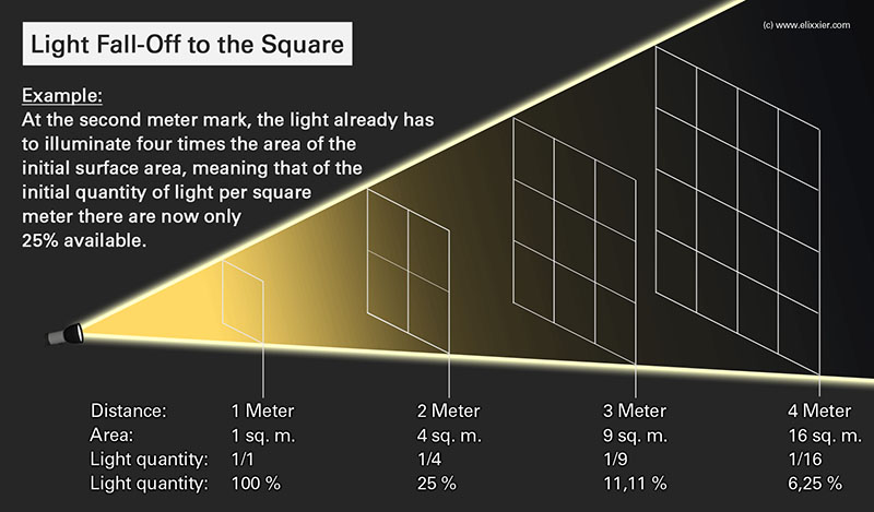
The Inverse Square Law gets its own graphic.
So, for our purposes remember this: keep friendly (soft) lights close and keep enemy (harsh) lights even closer. The best (most flattering) lighting you can use is one that is close and large and thus it does not need to be so bright to light you well (you can even drape some kind of diffusion cloth over it to make it even softer and more flattering). If the light is farther away, it will need to be brighter; and it will tend to cast darker shadows.
I could talk about lighting all day. But let me end this section with two more points.
Think about the temperature. All light has a Kelvin temperature that dictates its color. Fluorescent light can be greenish (avoid it if you can). Incandescent lightbulbs (the standard ones everyone used to have) are a warmish orange. Daylight is generally rather white.

All of this temperature variation is fine, and modern cameras, even the tiny ones inside computers and phones, can usually adjust decently to light temperature and present you decently. But most still present fluorescent pretty badly, so you want to stick to warmer (incandescent) or whiter (daylight) temperatures.
What is more, many cameras go haywire when they sense multiple light sources: say when there is a mix of overhead fluorescent, a tungsten desk lamp, and daylight streaming in from the window. Heck, even great cameras have trouble dealing with mixtures like this, which is why some real estate photography looks so horrendous. So the tip is to give your camera a break and see if you can limit your lighting to one temperature source, agan, most preferably daylight (back to that sunlight in the window again, or use incandescent lightbulbs you will find labeled as “full-spectrum” or “daylight”).
Reflection is still light. Near or far, you don’t want to have light bulbs blazing at you. Ideally, they will have a shade or other method of diffusion over them to make their light a bit less specular or harsh. And if you only have one light source available to you for your video chat, and it is set at 45 degrees off-center, you can introduce another "light" into the equation by adding reflection. Take a large piece of white foamboard or a large sheet of white paper or cardboard, and place it on the other side of you, out of the camera’s view. This will capture some of the light that passes by you from that one light source, and bounce it back on your other side, filling in your shadows and giving you a nice, even, professional look.
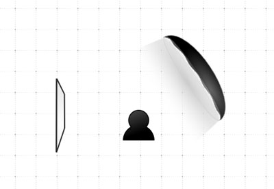
Another good setup, with reflector (on left).
Similarly, if you only have that one overhead light, sit back from it, as mentioned, and then try putting that white paper or foamboard over your keyboard, slightly angled toward your face, to bounce some diffuse light back onto you, to even things out.
Remember, what we are going for here is a large, even, diffuse, and flattering light. In the biz this can be referred to as “beauty light” because the bright, soft illumination tends to eliminate shadows and imperfections. And who doesn’t want that?
Next up: Composition