Old Company, New Brand
Leader Evaporator
- July 2020
- Design
The 133-year-old maple equipment manufacturing company decided it was time for a complete rebranding. We dug in.
The process began with several weeks of interviews with stakeholders: staff, dealers, and customers, to understand what the brand meant, what it meant to do business with the company, what the history was, and where the company was going. It also meant cataloging the many versions of the logo that had gone before:
![]()
In the end, we concluded that Leader as a company stood on three pillars: craftsmanship, community, and creativity. These became the central themes that we built our storytelling around, whether it was in marketing via video or print, on social, or on the website.
What this meant for the logo redesign process was finding new ways to reflect the company's long history, its dedicated community, its enduring creativity.
The final design retained the sugarhouse and a hint of the old colors, while introducing a more simplified, yet classic, design. And one that simplified the company name down to simply "Leader."
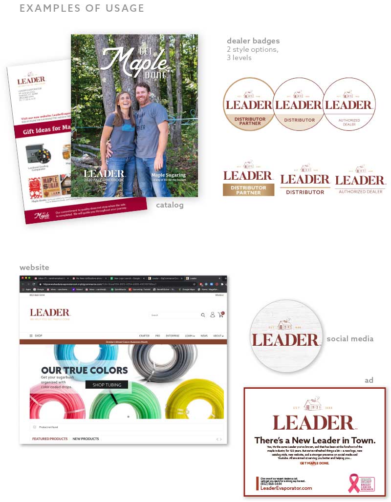
This then became supplemented with different versions, a wordmark only version, a version with the "We Help You Get Maple Done" tagline, and the spin off of the Get Maple Done wordmark. All new usage guidelines were codified into a Brand Guideline book.